Why Free Trial Users Disappear After Day One
Learn why SaaS trial users sign up and vanish, and how to improve first-session value, onboarding, follow-up, and trial-to-user activation.
On this page
- The first session makes a promise
- Look for the first-value event
- Find the moment people actually leave
- Make the empty state do some work
- Reduce effort without hiding important decisions
- Send a useful follow-up, not a guilt trip
- Sometimes the product is simply not needed
- Try a focused two-week improvement
- The bottom line
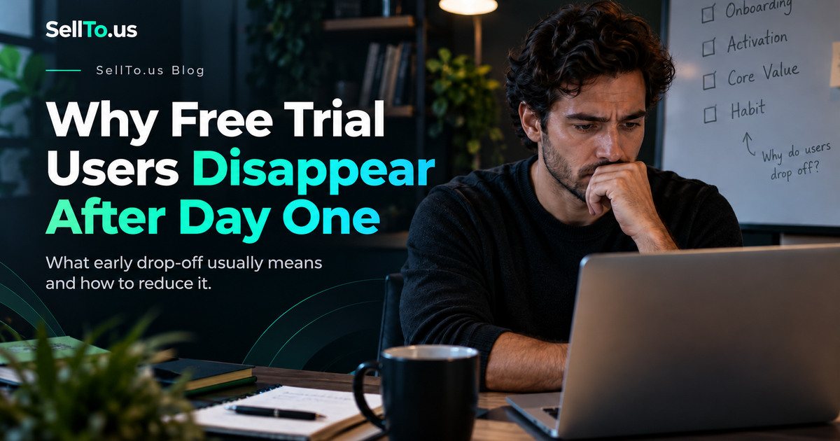
Someone finds your SaaS, creates an account, and even confirms their email. For a moment, your analytics dashboard looks encouraging.
Then nothing. They don’t finish onboarding. They don’t return the next day. They don’t reply to the welcome email.
It’s tempting to blame a short attention span. But when people disappear from a free trial, the more useful question is often: what did they expect to happen, and what actually happened instead?
A signup tells you someone was curious enough to give your product a chance. It doesn’t tell you they understood it or received value.
The first session makes a promise
Think of the last app you tried. Maybe you signed up because its website promised to organize your invoices, turn messy notes into a summary, or help you manage clients.
You were expecting relief. Instead, the app asked you to create a workspace, invite teammates, fill out a profile, select preferences, and connect three integrations.
By the time you reached the useful part, the excitement was gone.
This isn’t an argument against onboarding. It’s an argument for designing onboarding around the thing the user came to do.
For a note summarizer, the first win might be uploading one note and receiving a readable summary. For a bookkeeping app, it might be categorizing one expense. For an idea-testing platform, it might be submitting a concept and receiving a useful first result.
Write down that first meaningful win in one sentence. Then count how many steps separate signup from that moment.
Look for the first-value event
Businesses often track registrations because they’re easy to count. A better early metric is the action that demonstrates the user actually experienced the core value.
Examples:
| Product | Possible first-value event |
|---|---|
| Invoice app | User creates and sends an invoice |
| Scheduling tool | User books a real appointment |
| Language-learning app | User completes an interactive lesson |
| Research tool | User receives and reads the first result |
| Team dashboard | A teammate successfully completes a task |
The exact event depends on your product. Don’t count a decorative tour completion as activation if it doesn’t help someone achieve anything.
Find the moment people actually leave
You don’t need sophisticated analytics to start. Draw a short path:
Visit → Sign up → First action → First useful result → Return → Pay or continue
Look at the stage where people stop. Then speak to a few users who reached that stage.
If visitors sign up but never start, the interface might be confusing or the next step unclear. If they complete the first action but don’t return, the output may not be compelling enough. If they return but never pay, your ongoing value or pricing explanation may need work.
Don’t change your prices just because trial conversion looks disappointing. First check whether people have experienced the product’s value at all.
Make the empty state do some work
A completely empty dashboard can be intimidating. It tells the user what they haven’t done without helping them begin.
A useful empty state can answer three questions:
- What can I do here?
- What’s the smallest action I should take now?
- What will I get afterward?
For example, “Paste your first idea. We’ll help you make it clear, then show potential questions to investigate” is more useful than “You have no projects yet.”
Show an example if necessary, but label examples clearly. Don’t pretend preloaded sample data belongs to the user.
Reduce effort without hiding important decisions
Autofilling every possible setting might look convenient, but it can be dangerous if those settings change the result. Good onboarding makes easy choices for low-stakes details while keeping important assumptions visible.
For example, a default audience can help someone begin an idea test, but the tool should make it obvious who the audience is. A default currency or country should be easy to change.
The aim is not zero decisions. The aim is no unnecessary decisions before someone understands the value.
Send a useful follow-up, not a guilt trip
An email that says “We miss you!” usually says more about the business than the customer.
A stronger follow-up references an unfinished action and offers one useful next step:
Subject: Want to finish your first test?
You started exploring your idea but didn’t finish submitting it. If you got stuck on the audience or description, here’s a short example that may help. Your original text is still available in your account.
That message only works if the statements are accurate, the user opted into the relevant communication where required, and their saved draft genuinely exists.
Avoid false deadlines, manufactured urgency, or frequent reminders. Respect the user’s notification choices.
Sometimes the product is simply not needed
This is a difficult but useful possibility. Someone might have signed up because the landing page sounded exciting but discovered that your tool didn’t solve an urgent problem.
That’s not necessarily an onboarding bug. It might be a positioning problem.
Ask people who leave: “What were you hoping to accomplish?” Then compare their answers with your homepage promise and what the product actually does.
If the gap is large, fix the promise or the product, not merely the reminder emails.
Try a focused two-week improvement
During the first week, map the onboarding path, watch a few users attempt their first meaningful task, and identify the biggest point of friction.
In the second week, change one material part of the experience: maybe a confusing form, an empty-state message, or an unnecessary setup step. Then compare completion behavior without pretending that a small sample proves a universal effect.
Qualitative sessions tell you why people hesitate. Product analytics can show whether the behavior changes at a larger scale.
Frequently asked questions
Does a longer free trial always improve conversions?
No. If customers never reach the first useful result, adding days may not help. Improve their initial experience before changing the trial length.
Should I require a credit card to start a trial?
That depends on your market, abuse risks, and customer expectations. Requiring a card changes who signs up and creates additional friction. Test the decision with honest, clearly disclosed billing terms.
How many welcome emails should I send?
There isn’t a universal number. Start with the smallest sequence that helps users complete a meaningful task, respect consent, and evaluate unsubscribes alongside engagement.
The bottom line
You probably don’t need a brighter signup button. You need to help the right people do something useful sooner.
Before changing the interface, try the free Customer Objection Finder to brainstorm potential concerns, then confirm them by watching or interviewing actual users. You can also explore a revised app concept on SellTo.us, remembering that simulated reactions are not observed retention data.
Written by the SellTo.us Team. Examples in this article are hypothetical. SellTo.us results come from AI-simulated participants, not real people, and don’t predict sales or guarantee success.
Related articles
How to Launch a SaaS Product in 2027: From Waitlist to First Paying Users
A waitlist is a list of maybes. Turning it into people who use your software every week, and then pay for it, happens one small batch at a time.
How to Validate a SaaS Idea Before Writing Code
Most SaaS risk lives outside the code. Here's how to check the problem, the buyer, the price and adoption barriers before you build anything.
How to Find Customer Objections Before Launching a Business
Every new offer meets hesitation. Here is how to find the reasons people might say no before launch day, check which ones are real and fix them in your offer and message.